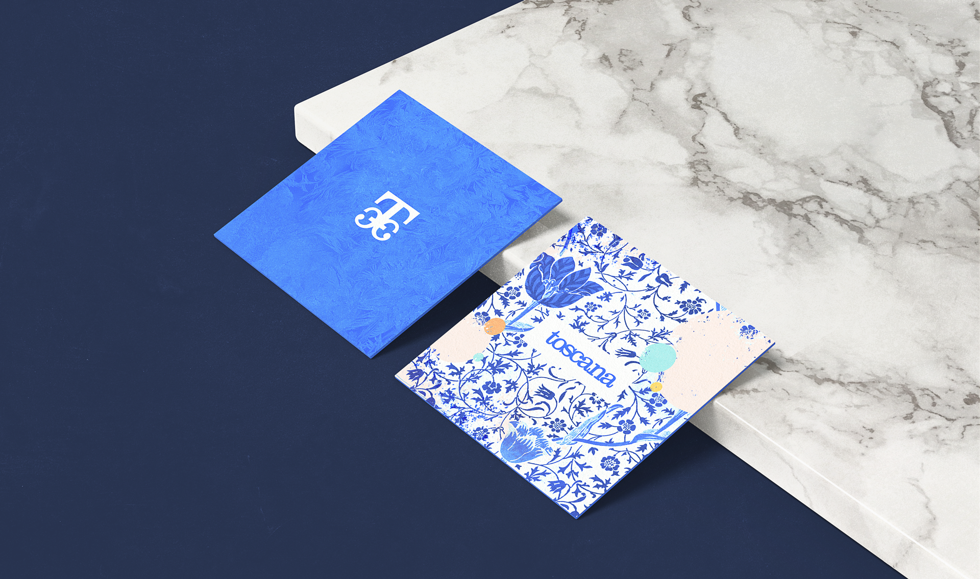
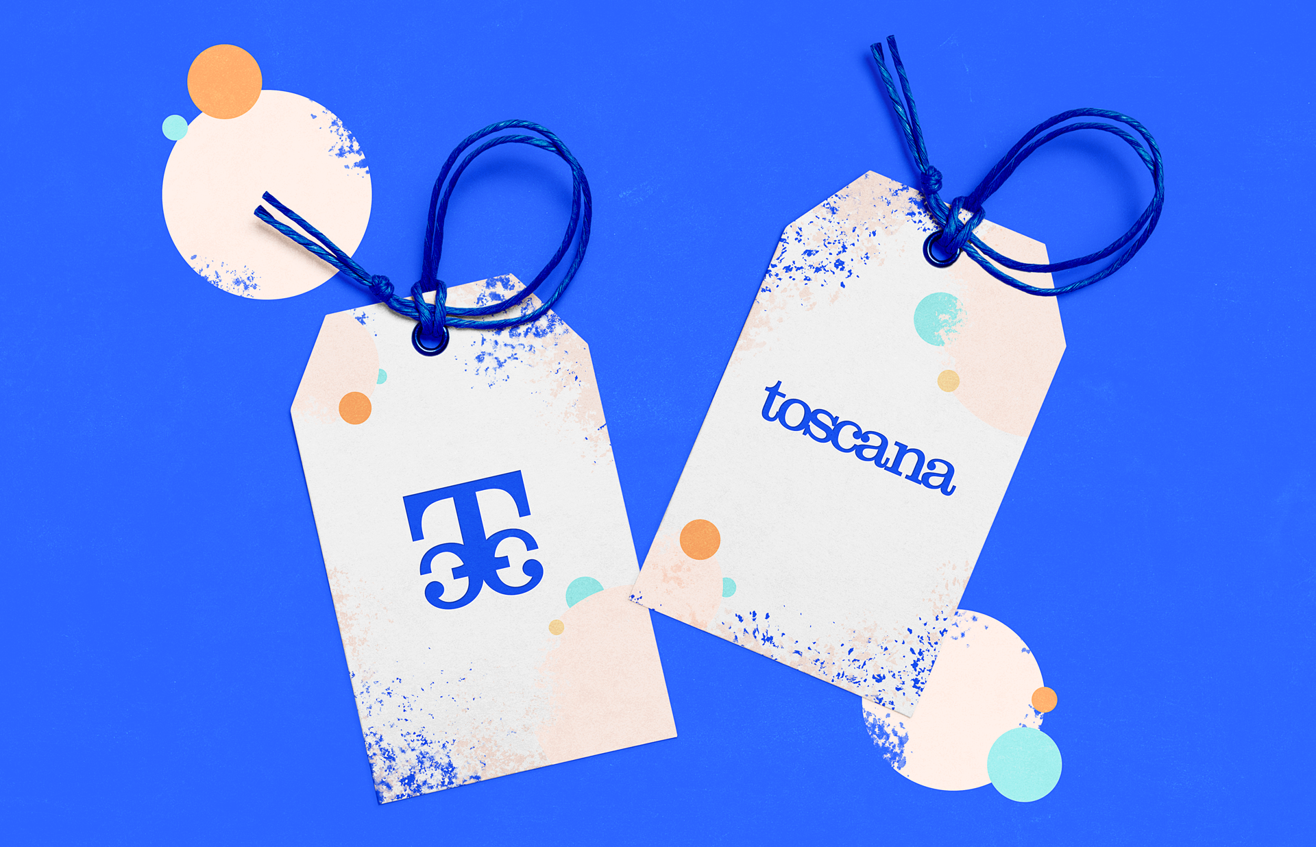
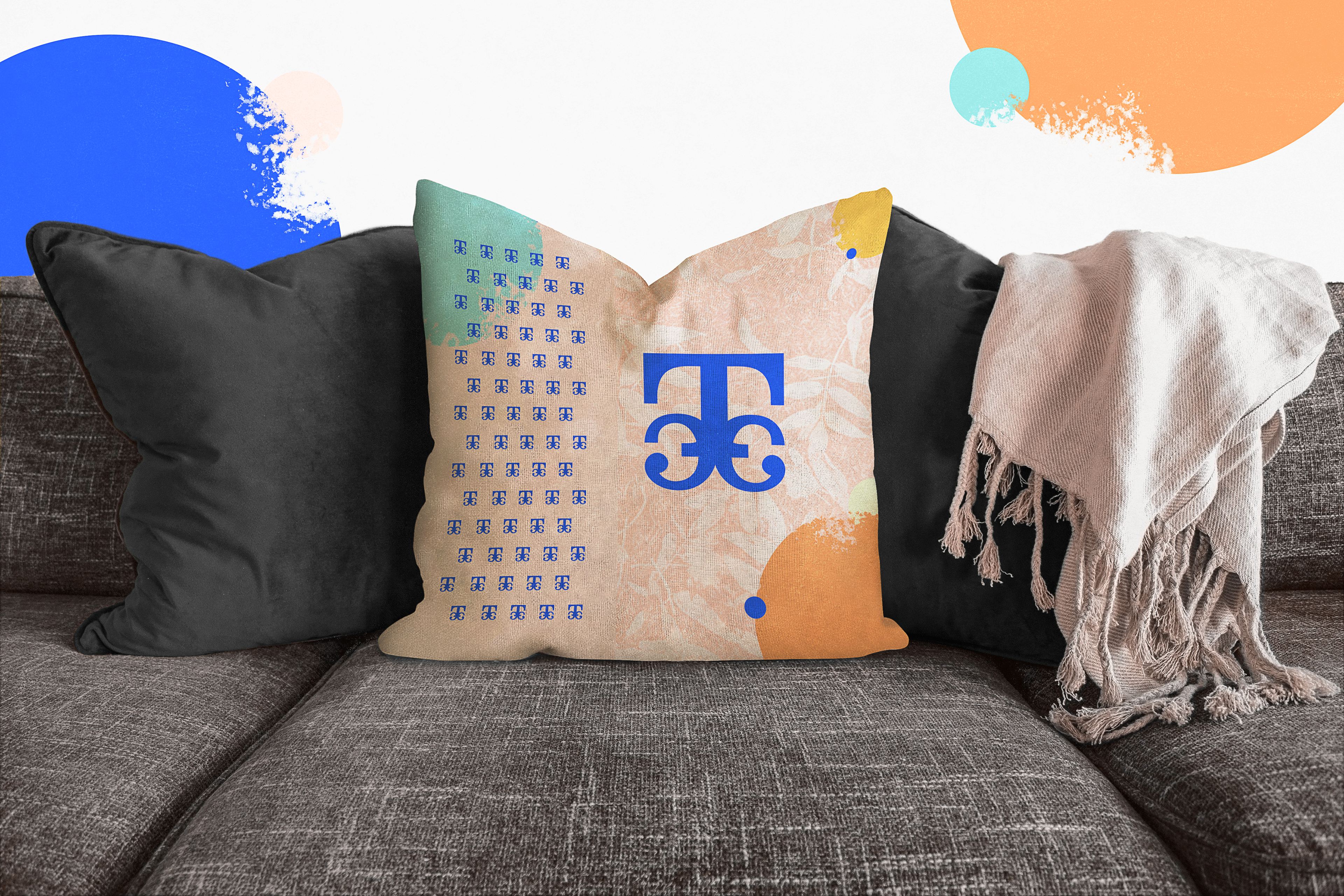
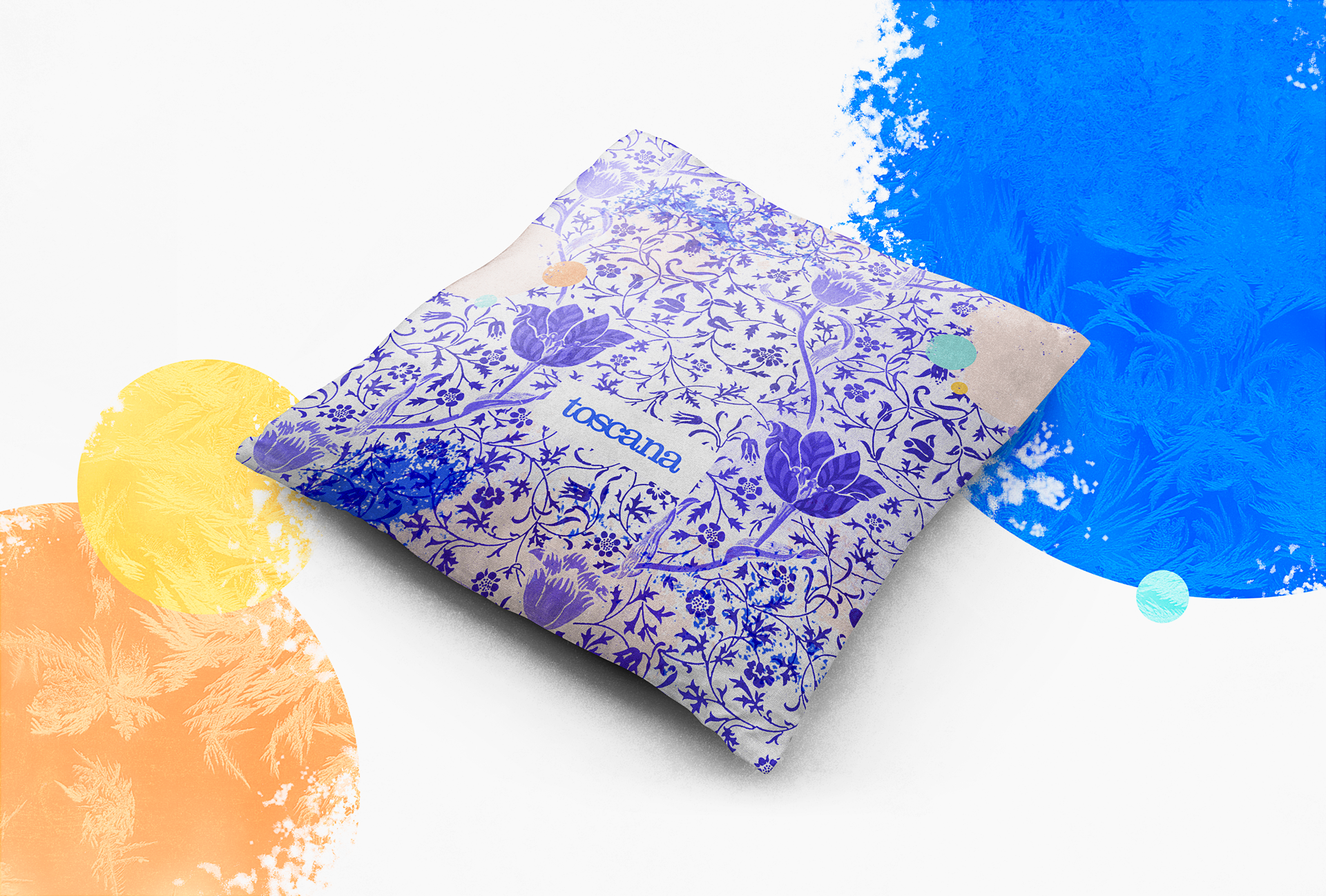
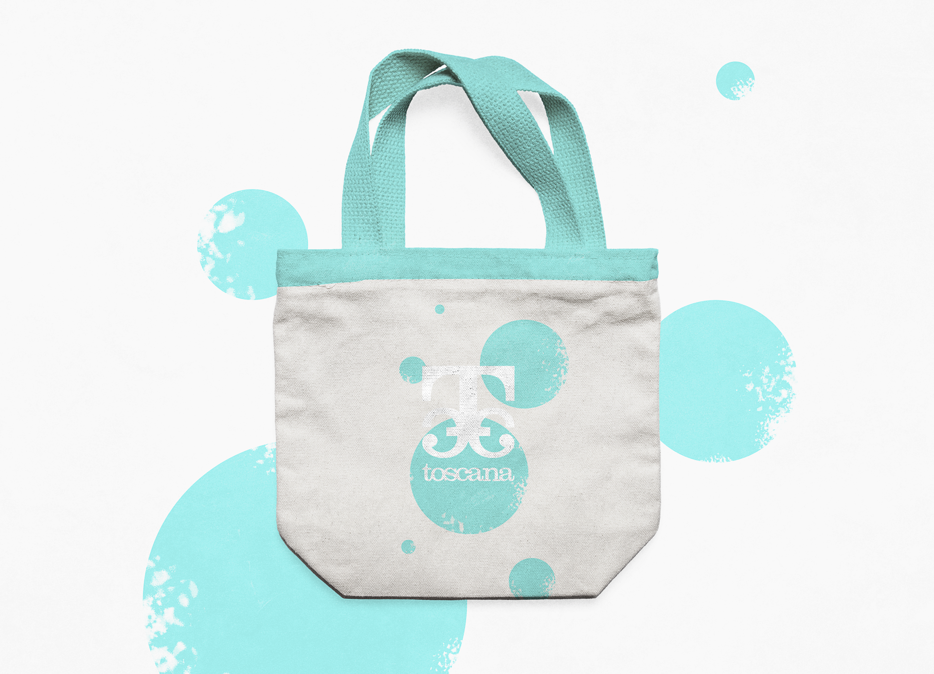
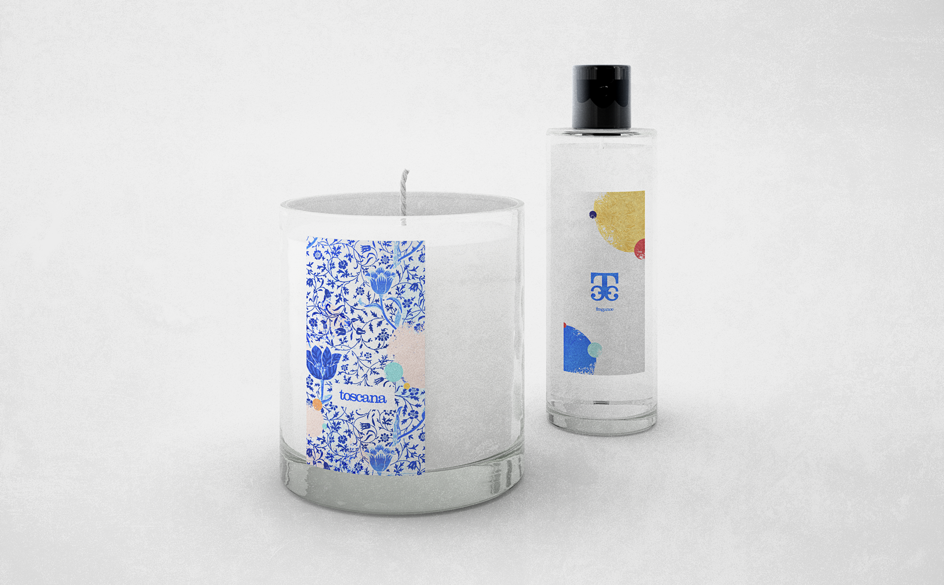
The graphic universe of Toscana takes elements from Mediterranean culture and captures the colors of nature such as the blue sky in Costa Blanca or the sunset in Tuscany. This region in particular gives the name to the brand, inspired in its beautiful landscapes, architecture, art, history and gastronomy. The result is a delicate but colorful and fresh brand, highlighting its values of sustainability and simplicity.
-
Toscana is an entrepreneurship that offers home design ideas and quality products combining functionality, art and simplicity with a sustainable approach.
We promote a slow living lifestyle. We want to live a connected life and increase our sense of wellbeing by simply relaxing a little and focusing on the things that are most important to us.
With our philosophy we attempt to encourage people to think more about responsible consumption and enjoying the good things in life with good people.
_
mission.
Inspire people to create spaces that transmit well-being.
vision.
Beautify the daily life of many people in a simple and responsible way.
values.
Responsibility - Integrity - Wellness - Simplicity - Quality - Responsible Consumption
_
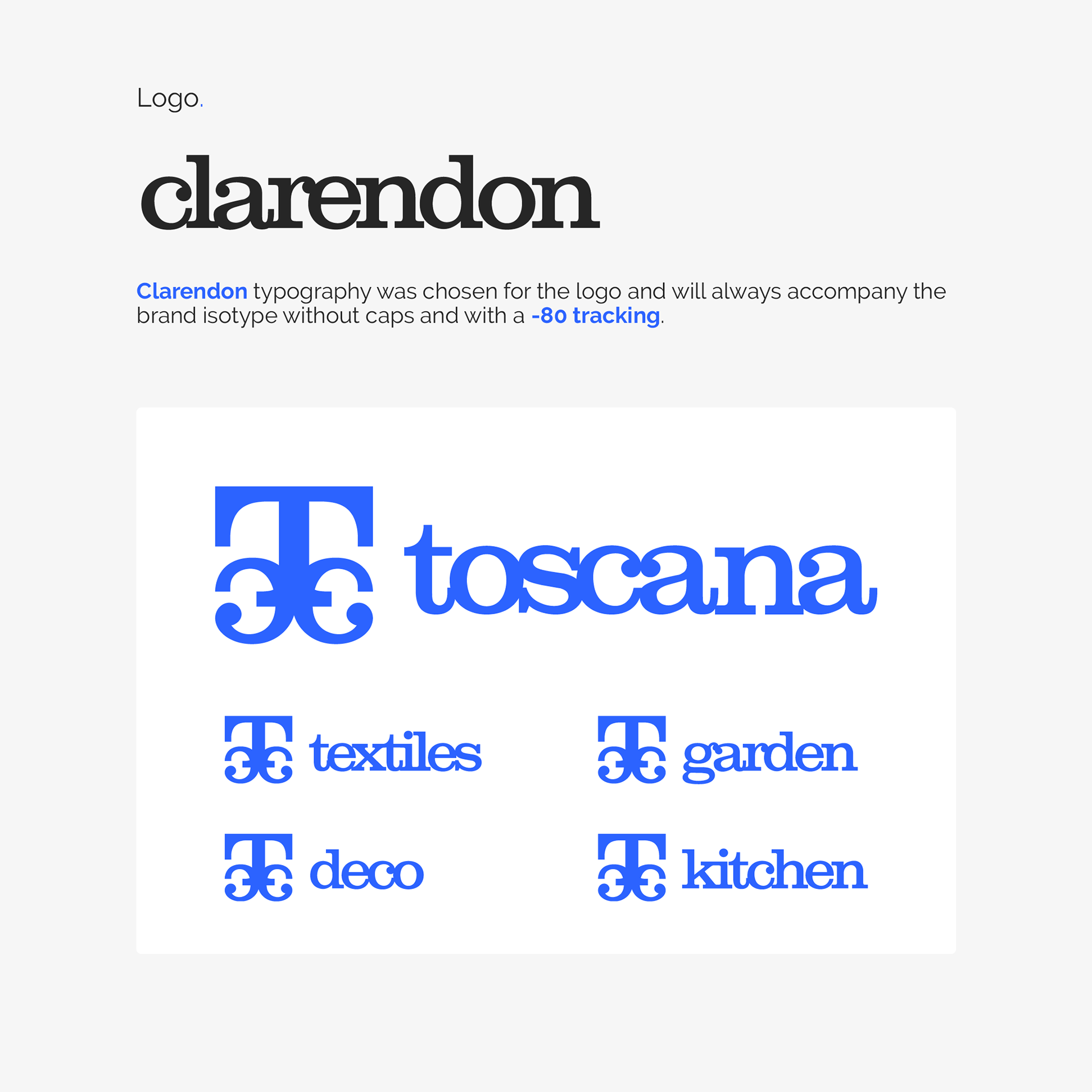
logo process.
ᐁ

_
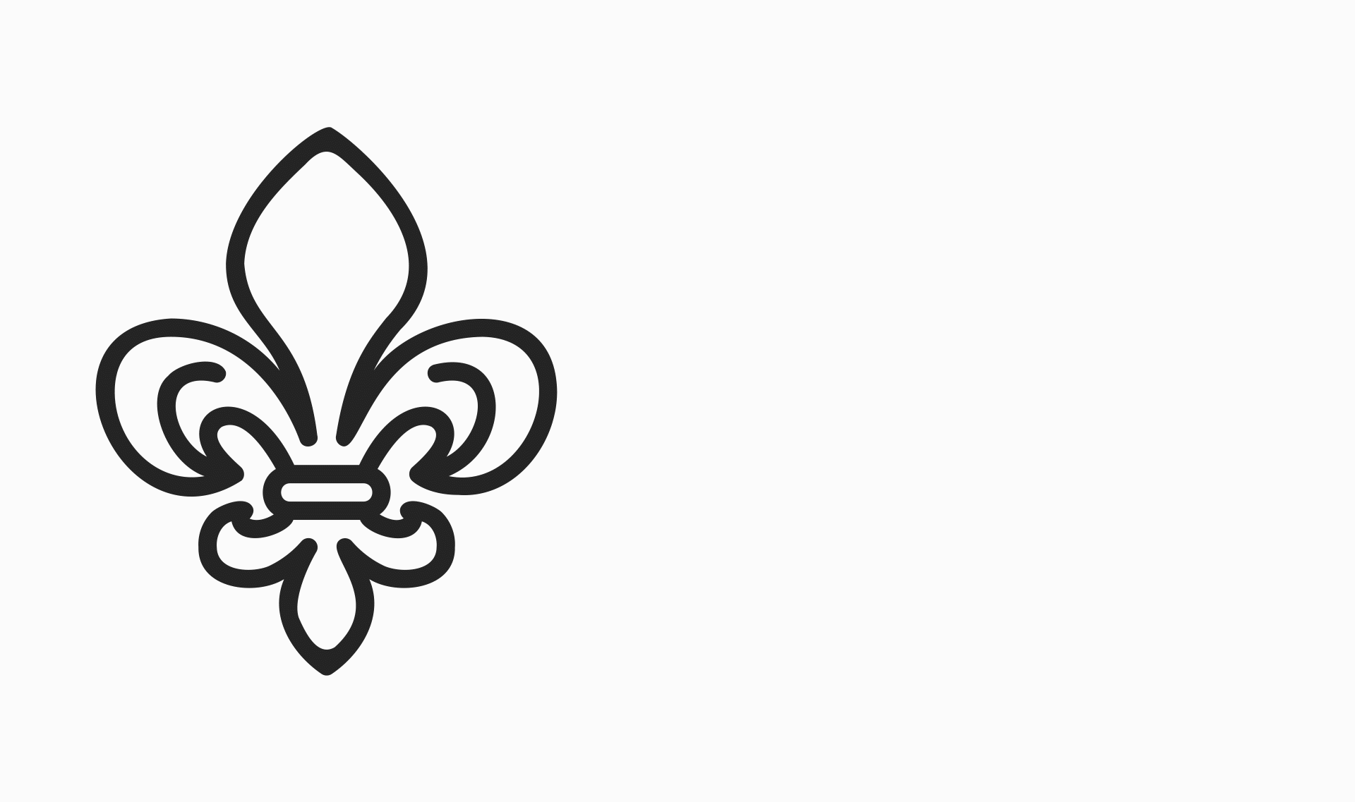
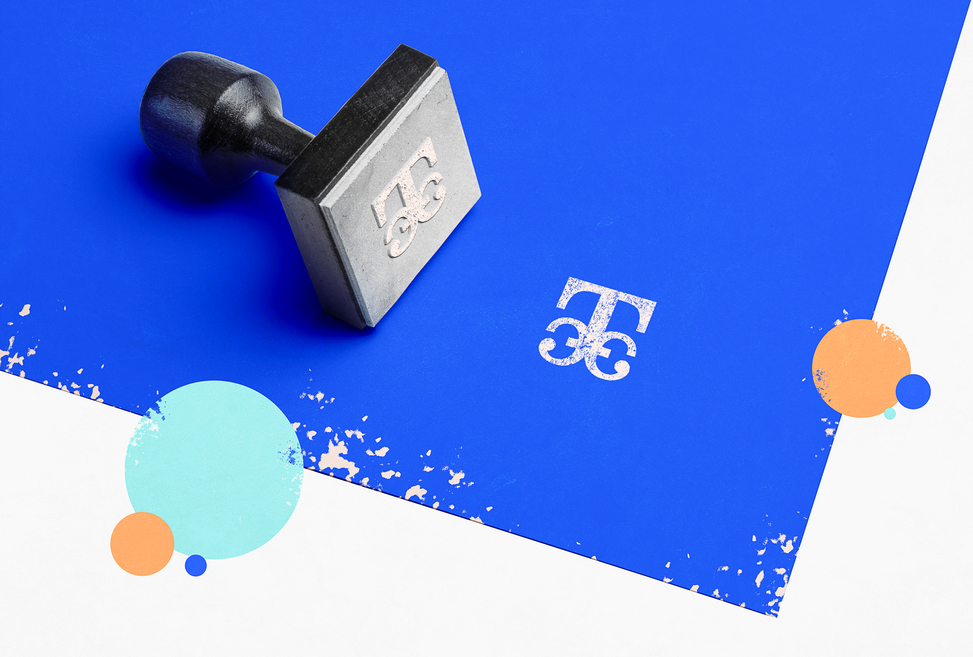
isotype process.
Fleur de lis inspired design.
ᐁ
_
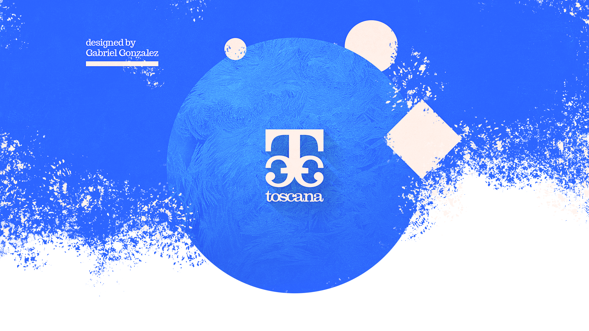
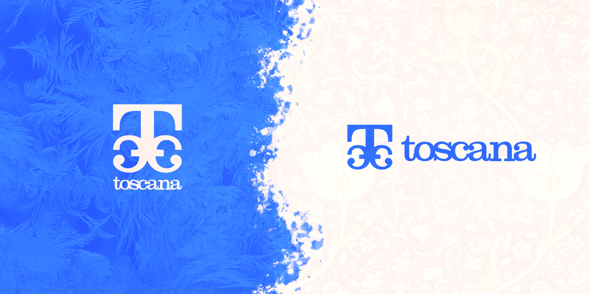
imagotype.
ᐁ

_
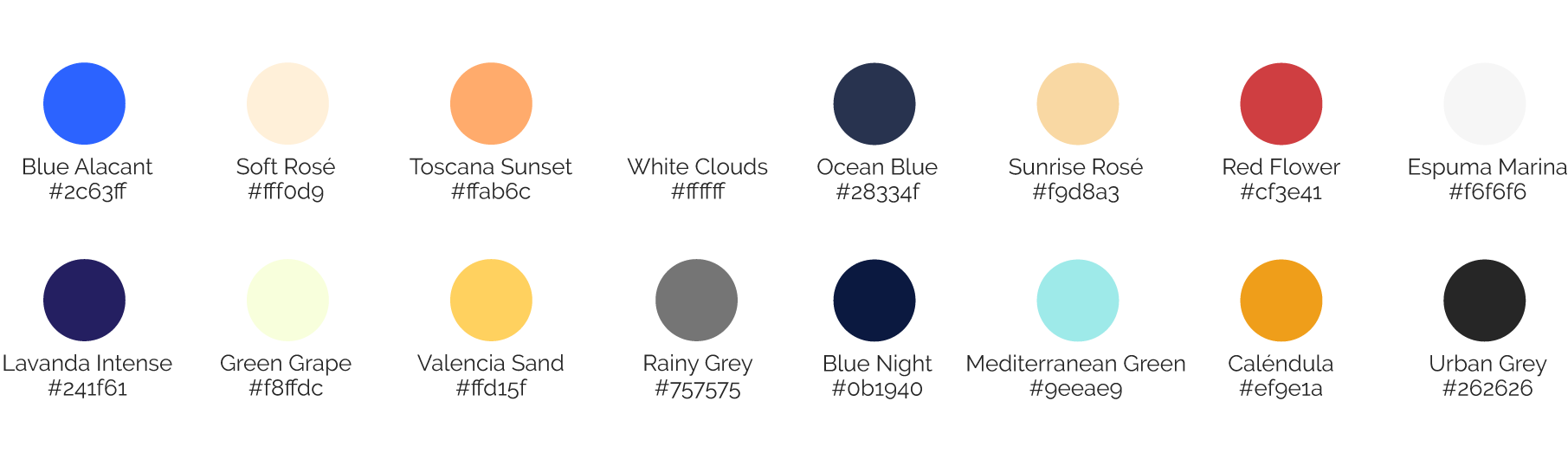
our colors.
Inspired by our context and nature.
ᐁ


_
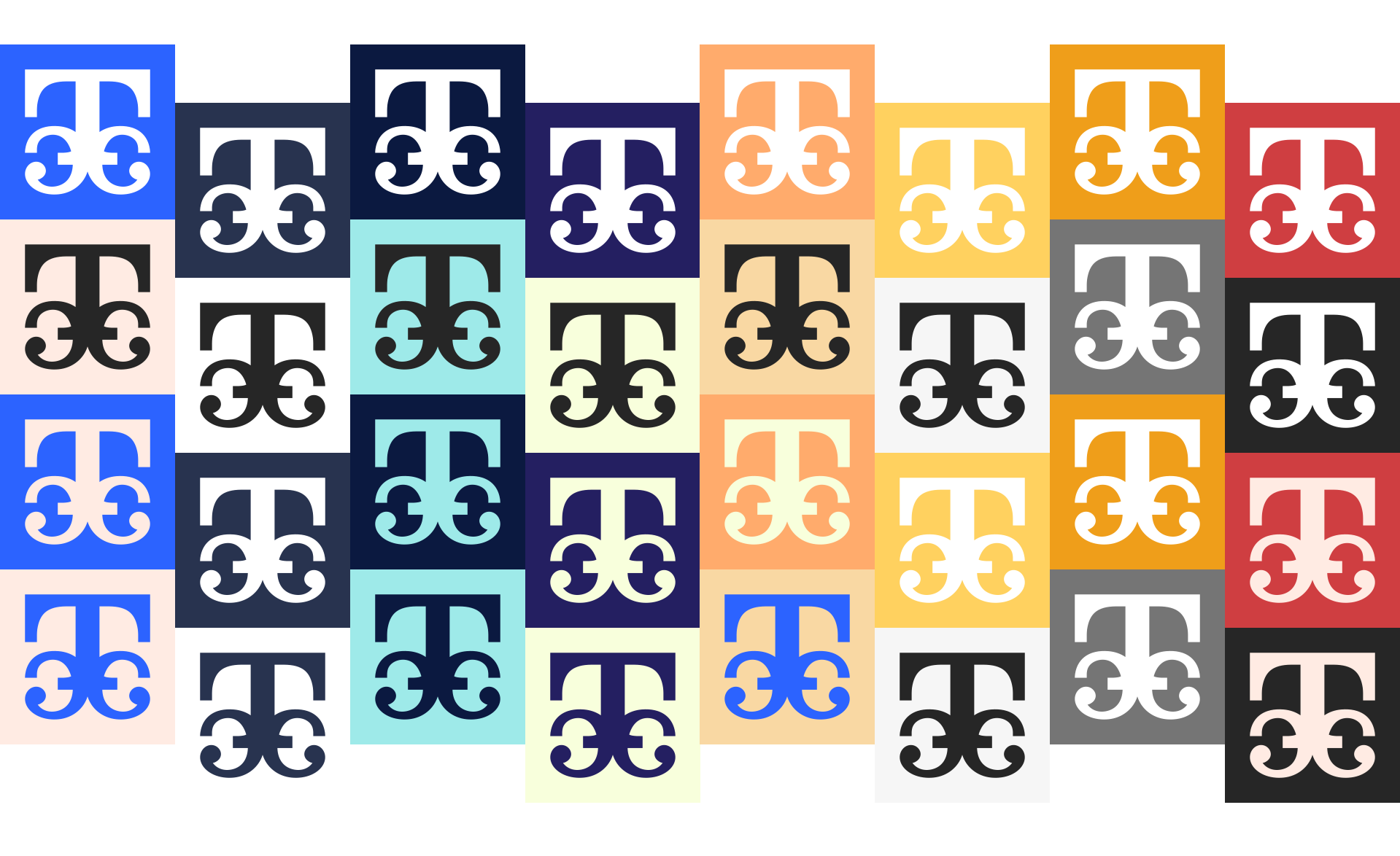
some possible duotones.
ᐁ
_
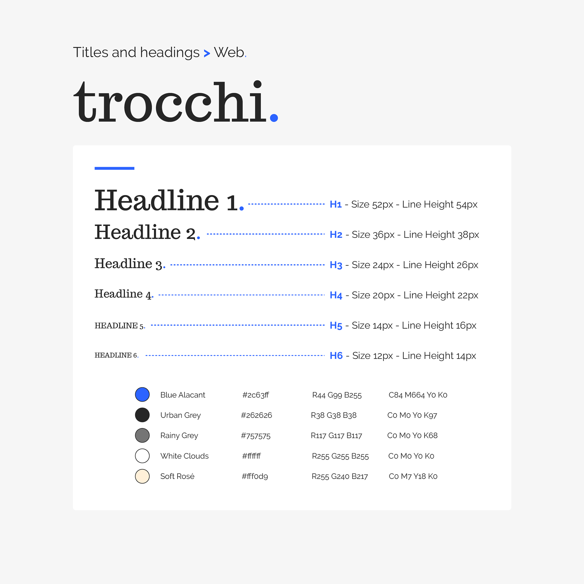
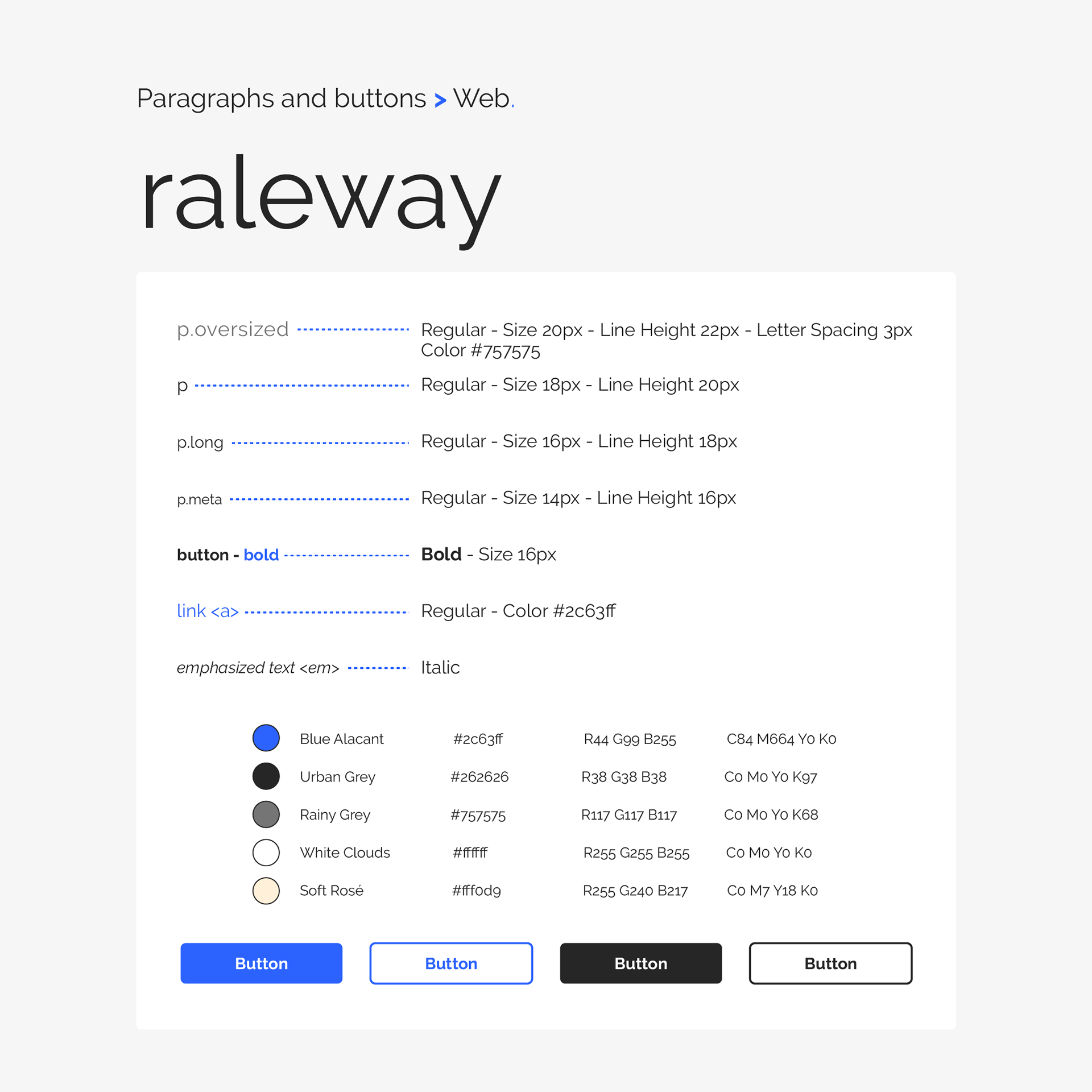
typography.
ᐁ

_
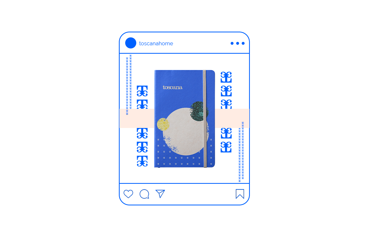
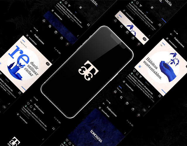
social media.
ᐁ